
The ABC recently ran a story about the Australian discus thrower, Dani Stevens. The performance of all female discus athletes over time was displayed in the below chart.
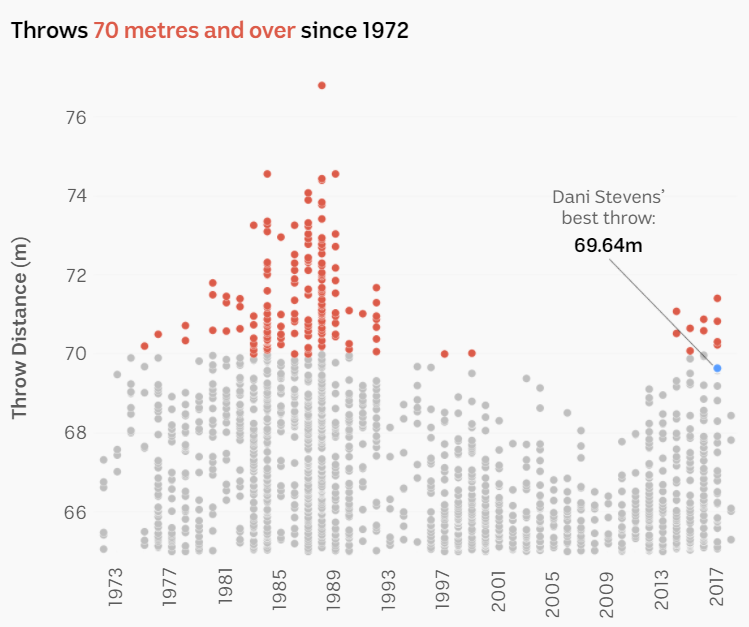
This image is a great example of turning data into information through graphics. Representing every throw as a single dot over a multi-year timeframe gives context and using red to highlight throws over the 70m mark (regarded an exceptional performance) draws attention to outliers. The graphic immediately piques curiosity invoking further questioning to explain the historical pattern of performance. (In this case, the red in the eighties is explained by systemic doping in the former Soviet Union – which suggests modern doping techniques could also be supporting the recent surge in red distances.)
But this message could so easily not be conveyed. Picture a chart that displayed only the last five years. Or a chart that showed Dani’s performance, not the performance in the context of others. Or a chart of Dani’s performance compared to a static line representing the 1988 world record throw of 76.8m (i.e. “world’s best”). What questions you would have asked then? If Dani Stevens was a business, would you shut it down as it is so far off the “world’s best” target you have in your vision?
Information is often buried in a data pack or on a dashboard with dozens of other measures and often in raw numerical form. Collecting performance data is one thing, using it to inform good decision making is another.
How useful is your organisation’s performance data?
Full ABC article and credits here.
Mark is Principal Consultant and Director of Pivotal Point Strategic Directions. He has a rich history working with organisations identifying the best performance measurement aligned to their purpose.